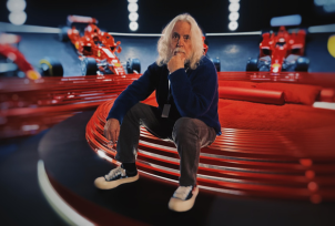
ROBERT RICHARDSON
Robert Richardson ASC is an award-winning American cinematographer known for his use of high contrast lighting, shapeshifting style, dynamic camera movements and keen eye for detail.
He has won the Academy Award for Best Cinematography three times, for his work on JFK (1991), The Aviator (2004), and Hugo (2011). He also won a lifetime achievement award at the ASC in 2019 and he and Quentin Tarantino took home the cinematographer-director duo award at Camerimage in the same year.
Richardson is and has been a frequent collaborator for several leading directors, including Oliver Stone, John Sayles, Errol Morris, Quentin Tarantino, Martin Scorsese, and Andy Serkis.
Following the shoot of a documentary in El Salvador during the height of the conflict, Richardson met Oliver Stone who hired him for Salvador (1986) and Platoon (1986). From there, he worked almost exclusively for Stone, filming Wall Street (1987), Born on the Fourth of July (1989) and The Doors (1991).
His talent and dedication has earned him an impressive career over the years, and he continues to influence and inspire the world of cinematography with his innovative techniques and artistic flair.
—
What appealed to you about being a judge in the FilmLight Colour Awards?
What appealed to me, in respect to being a judge for the FilmLight Colour Awards, was my deep respect for the colourist. I have had numerous inspirational relationships with those that grade the projects I have worked on, and I can confidently say that each of these relationships has resulted in an improvement on the work I provided.
What will you be looking for in entries?
One thing I will be looking for is how well the visuals support the story.
But the process of judging the work of a colourist is complex, as there are many factors that play a part. For example, how early was the colourist involved? Did they create a LUT to use in camera or during post? What was their relationship with the director of photography? What is their history? With this in mind, I will also be looking closely at the supporting material and information the colourist provides about the project.
Otherwise, I am open to all, and I look forward to being surprised as well as exalted by the work.
How do you work together with your colourist to achieve the desired aesthetic?
When I work with a colourist on the grade of a film, I hope that the film itself has already spoken about what the desired aesthetic is. Over the past decade, I have worked on grading on set. The colourist has a room where they grade the dailies and I work with them as often as possible to explain what I am looking for, and to apply windows, etc. But let’s not forget that the cinematographer is not the sole voice in what a film should look like. The director is the final voice. I have my opinion and the colourist has theirs, but the director has the final say.
You often work with veteran colourist Yvan Lucas. Can you tell us more about the way you work together?
I have worked with Yvan for a couple of decades now, and I find his taste to be sublime. He is brilliant. His eye is finely tuned and his manner of working brings out the best in anyone in the room with him. He is fierce and loving at the same time. He began in a chemical manner – as a colour timer, working on actual film – and is now of course digital. There is a great advantage to this level of experience.
Can you tell us about your work with director Quentin Tarantino and the use of colour for his movies?
Quentin designs his films shot for shot and word for word and with that comes a very specific perspective on what he hopes the film will be viewed as in a visual perspective. His direction is impeccable in all aspects – from script to working on post, colour included. There is never one path for all films, but rather each carries its own identity.
What makes a good colourist, in your opinion?
A mind that is open yet opinionated. And an eye that is superior to my own.
Can you tell us about your relationship with colour and if/how this has changed or evolved over the years?
As the years move on so comes experience. Each film has an identity which needs to be revealed. Some are exposed smoothly and others not so much. Some scenes come easily where others battle. I have learned over the years not to force a perspective – I am far more patient than I was when I first began, but also far more experienced.
How do you think colour grading enhances storytelling in film and television? Can you provide an example from your own work where colour played a crucial role in conveying the narrative/emotion?
If you wish an answer to this, all one needs to do is turn off the colour in a film and watch it.
Try that with sound and without sound. Then try to imagine a film akin to The Red Shoes (1948) without colour.
In respect to my work, I cannot think of a better example than Martin Scorsese’s Aviator (2004). Marty’s desire to create a three-strip technicolor, two strip and tinting as well as a contemporary palette – this could only be accomplished in colour.
And finally, what are you working on now/what’s next for you?
I am currently between projects, although a number sit on the constantly-shifting horizon of the film industry.